
Joule Protean Brand and Food Packaging Design


Joule Protean Brand and Food Packaging Design
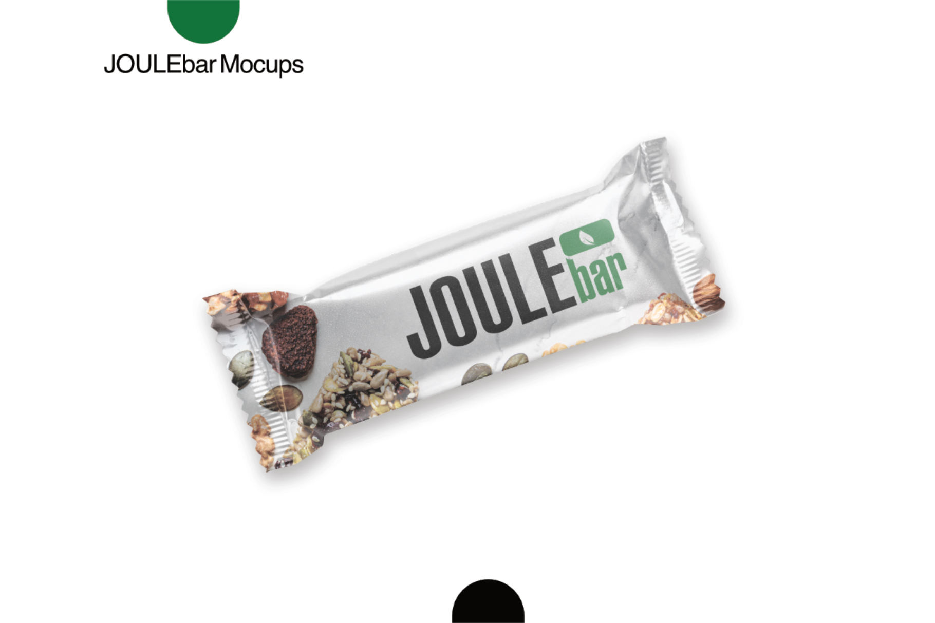
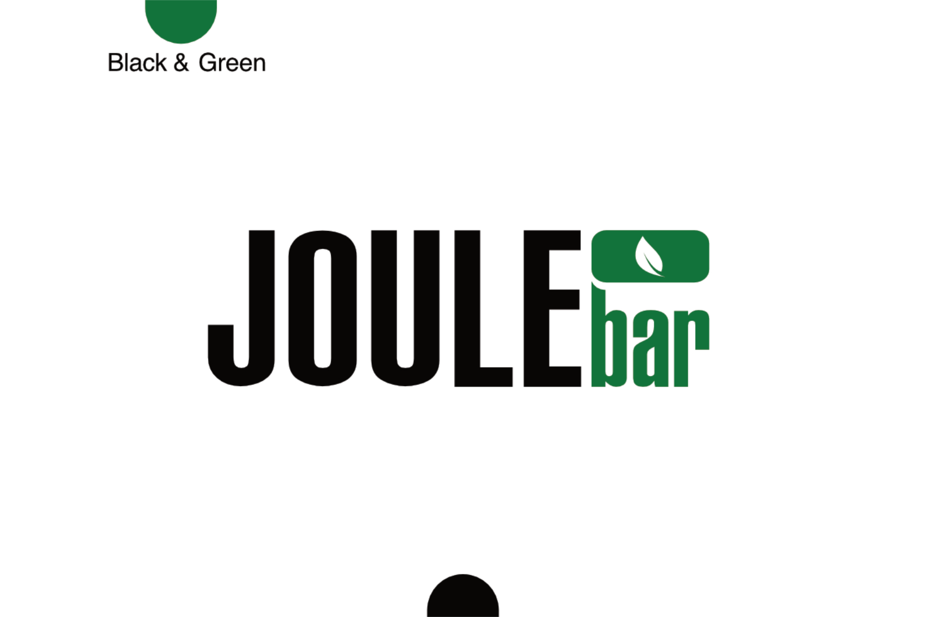
The Joule Protean brand and food packaging design encapsulates a commitment to health and sustainability, making it an ideal choice for conscious consumers. The logo combines green and black, symbolizing vitality, natural ingredients, and a modern aesthetic.

The green hue represents freshness, health, and organic quality, resonating with the brand’s focus on nutritious food options. It evokes the essence of nature and sustainability, appealing to environmentally conscious customers. In contrast, the bold black elements convey strength, sophistication, and a sense of premium quality, establishing Joule Protean as a trustworthy and high-end brand in the health food market.
The packaging design reflects the brand’s identity through sleek, minimalist aesthetics, prioritizing clarity and functionality. Clear, concise labelling emphasizes the product’s ingredients and nutritional benefits, making it easy for consumers to make informed choices. Using eco-friendly materials aligns with the brand’s values, reinforcing its commitment to sustainability.

Overall, the Joule Protean branding and packaging design create a compelling visual narrative that attracts attention and communicates the brand’s dedication to health, quality, and environmental responsibility. This thoughtful approach ensures that Joule Protean stands out in a competitive market, appealing to those who seek nutritious and sustainable food options.